BIODIVERSITY CARTOGRAMS
As your final exercise for the Resource Mapping course I have been experimenting with the prepartion of cartograms[1]. The data used is biodiversity related and includes degree of threat and rarity from the IUCN Red Data list of threatened species, with the link to the site here.
Unfortunately, I did not have the latest data prepared as GIS layers, this is what you will be doing as an exercise, so this is the data extracted for 2000.
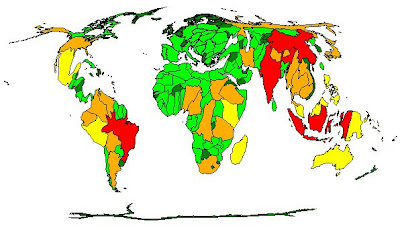
The cartograms have scaled each country's size to the value of the variable (e.g. number of threatened fish species). Further the maps are thematically shaded with red indicating the highest value of threatened or endangered status going through orange, yellow, light green to dark green which represents the lowest values.
 Percentage of threatened plants in the flora
 Number of threatened invertebrate species
 Number of threatened fish species
 Number of threatened amphibian species
 Number of threatened reptile species
 Number of threatened bird species
 Number of threatened mammal species
As you can see South Africa is a Biodiverse region that has high risks of extinction, especially for plant species.
Reference
[1]Gastner, MT and Newman, MEJ 2004. Diffusion-based method for producing density-equalizing maps. Proc. Natl. Acad. Sci. USA 101, 7499-7504.


